
As the year draws to a close, we wonder what 2017 will hold for us as web designers. If you’re not eating, drinking, and breathing web design, you might not even notice these shifts. They’re on the subtle side, that’s for sure.
Mobile Comes First
In the past, websites have been designed for the desktop first and the mobile device second. But now that smartphones and tablets are so ubiquitous, web designers are creating sites that work well on mobile and smaller screened devices first, then work up to a design for the larger screen. Makes sense!
User Experience Gets More Consistent
When the web first got going, you might find a site with the nav bar on the top of the screen, on the left of the screen, or no nav bar at all. Sometimes you might click all over an image to navigate to different parts of the website. Now, users expect the navigation bar to be in a a certain place, and they’re confused when it’s not. They expect that they can click your logo in the header and return to the homepage, and it annoys them when your site doesn’t work that way. As the web comes of age, it has also developed a language of user experience (UX) that is becoming universal.
Understated Animation
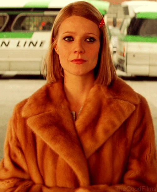
Cinemagraphs have been around for several years, but they’re growing even more popular. If you’ve seen a photo that looks static, but then a leaf rustles or a person blinks, that’s a cinemagraph. Personally, we love the drama that they bring to a design. You think you’re looking at a a plain image, but then you get a bit of interaction that surprises and engages you.
Understated animation effects are another trend to watch. You might see a tiny, delightful little animation as a page loads, or as you scroll. If it doesn’t work on a particular platform, it won’t kill the functionality of the website, but it does add a bit of charm when it’s there.
White Frames
The most current look for a website in 2015 and 2016 has been the full-width design, where photography stretches all the way to the edge of your screen. But more and more web designers are starting to build in a small, usually white frame to surround the design. It’s a clean look that can help mitigate the jarring effect of extra-bold colors or extra-large photography.
Going forward, we also expect to see websites adopt more outrageous color, bold typography, and video. We web designers are under maximum pressure to set our clients’ websites apart from the pack, especially given that navigation and other user experiences are becoming so standardized. Have you read through this list and thought that your site needs a bit of a refresh? Drop us a line, and we can give you a quote.


