Reader, we have looked at a LOT of bad app websites. Entrepreneurs will spend tens of thousands of dollars to develop an app, and then for some reason they will try to eke out a website on zero budget—or at the very least, with zero effort. We’ve even seen tools that claim you can create a free website for your app in minutes—but this is just the kind of website that’s immediately identifiable as an afterthought. As the app stores become yet more cluttered with soundalike apps and redundant app offerings, a website is the ultimate chance to set your app apart. Perhaps even more importantly, it’s your chance to upsell your in-app purchases and create a support portal that keeps people from leaving one-star reviews. And yet creating an app website must be a decidedly practical endeavor. Just check out this gallery of “30 Beautiful App Websites.” Many of them are defunct, and it’s likely because the app did not match up with the promise of the website.
Priority 1: Tell What Your App Does
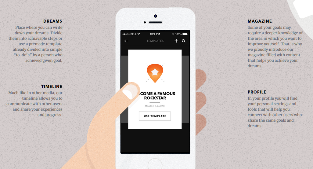
The Visionare app has a gorgeously designed website, and it’s clear that the artwork was done with great care.
But when it comes to the actual user experience (aka UX), you don’t find out that this website is (A) for an app and (B) that the app is meant for goal-tracking. It’s not till the fifth screen that the user can click to open a video on YouTube (why not embed the video right there on the page?) and it’s not till the sixth screen that the user can see screencaps of the app in action.
This website would have been so much better if it started with a straightforward description of what the app does. The YouTube video is a little on the long side at 1.5 minutes for a fairly simple app, but it could have been embedded on the page at the very beginning and set to autoplay. Or if you find autoplaying video offensive—and some people do—then at least they could offer a demo of the app with screenshots.
Priority 2: Provide a Link to Download Your App
Thankfully, we don’t find a lot of app websites that neglect to add a link to download the app. If the app is for Android and iOS, do provide a link for each!
Priority 3: Provide Support for Your App
It’s critical to test an app with a variety of users before you launch. And it’s inevitable that, during the testing phase, you’ll encounter a number of questions over and over. Hopefully you’ve been able to fix any issues that consistently cause confusion, but if there are still questions—document them! Put them in an FAQ on the website. The more problems you can anticipate, the better.
When it comes to providing help for your users, organization of your information is essential. Making it searchable is the easiest and ultimately the best way to make your information accessible. When picking a platform for your app website, we recommend that you investigate whether it offers native searchability. Wix is a great website builder, but they do not currently offer a search box component. Squarespace is another great website builder, though you might find yourself limited as to where you can put your search box. For most intents and purposes, we like WordPress as a platform for app websites. It offers robust searchability, it’s easy to set up an FAQ with toggle-open content, and it’s possible to make highly tailored contact forms, or you can integrate a third-party support ticket tool such as ZenDesk. You can even offer live chat features for you app, should you be so inclined.
Many app websites do link to Facebook and Twitter pages, where you could theoretically offer support. If you do, be prepared for negative tweets or Facebook posts from frustrated users showing up on your feed/timeline, and be prepared to respond quickly.
Priority 4: Upsell Your In-App Purchases
When you provide a service or feature that your customers really want, upselling can actually improve your relationship—all while generating more revenue and better retention. After all, wouldn’t you prefer to buy from a company you trust rather than start a relationship with a new company you’ve never done business with before? If a customer is searching for, say, limitations on storage space with your app, there’s the perfect spot to tell them that you provide extra storage space for $N.
There are other useful things you can do with your app website—like providing information about your company, showcasing your mentions in the press, or giving you a space to blog about your app’s uses or other industry-related topics. But if you’ve made the 4 items above your top concerns, your app website will be a winner. Does your app need a website that’s more than an afterthought? We’d love to help you; contact us.


