The era of the shiny button that looks like a gummy candy is over. And it’s been over for quite a while. (That style was known as ‘glass,’ by the way, and I spent a good number of hours learning how to add highlights and gradients to make graphic elements look like that back in the day.) When it comes to design for the web, flat design is a minimalistic trend that’s been around for several years, but has exploded of late. The flat trend is influenced by Swiss design, and it’s less distinctive than what we’ve seen in the past. That is, it’s largely defined by what it’s not; gone are those stylistic flourishes that make elements look three-dimensional. Flat design eschews drop shadows, bevels, highlights, and textures in favor of simpler shapes and icons that maximize functionality.
This revolt is against skeuomorphism, the type of trompe l’oeil design we’ve seen in computer software and websites since the inception of the Mac. When a shopping center has a fake limestone façade—that’s skeuomorphism. When a vinyl floor is printed to look like wooden planks—that’s skeuomorphism. And when the music editing application on your computer looks like its real-life counterpart, complete with knobs, buttons, and sliders—that’s skeuomorphism.
The idea behind the flat design movement is that the computer has been around long enough to know what we’re doing with it. Instead of converting a real-life object like a calendar into a realistic illustration, we might have a screen filled with tiles, dates, and text. Microsoft was actually one of the first adopters of flat design with its design for Windows 8, but now it’s spread to Apple and Google too. fltdsgn.com shows a number of great examples of flat design in practice on the web. Note how easy it is to focus on the text and images in the absence of ornamentation.
The Advantages of Flat Design
Skeuomorphic interface elements take up a lot of screen space, and they rarely offer numeric input or feedback for accurately setting values. Today, a user of video editing software like Final Cut Pro may have never used its analog analogue. Some even say that skeuomorphic design may “increase cognitive load” with visual noise that offers little or no value to the user, and that ultimately it limits creativity by grounding the experience to a physical equivalent in the real world.
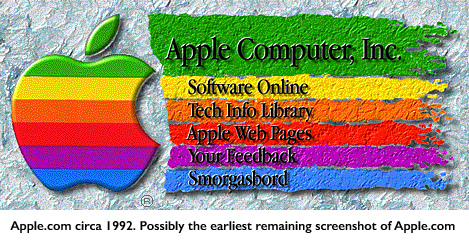
And guess what! A flat design could help you future-proof your website design. Let’s be honest; web design in general has a frustratingly short life. But flat design doesn’t have the ornamentation that so quickly made past iterations of web design trends look dated. Apple’s earliest homepage in 1992 was a riot of drop shadows, textures, and other 3D effects—hardly bearing any resemblance to the high design brand we think of today. If you looked at a website today that looked anything like that, no doubt you’d close the tab in a hurry, wondering why they hadn’t updated their website in over 10 years or if they just had really terrible taste.

What Will Come After Flat Design?
Some designers have already predicted the demise of flat design. They say it’s too unforgiving. The lack of visual cues like drop shadows that indicate a button can be pressed—or even the removal of buttons altogether—keeps users from visually processing the website quickly. The last thing you want is to lose your user because she doesn’t know what to click (or swipe) to navigate your website… the result is the same as if you had a 1995-era website like that Apple homepage above.
That’s why we don’t advocate strict adherence to an esoteric design ideal of flat design. As always, we take what works from a variety of sources. We design every website based on the user, giving them as many cues as possible to lead them through the experience we want them to have.
Does your website still have glass buttons? Need a redesign? We would love to take a look and consult with you to create a site that’s modern and highly functional. Contact us.


