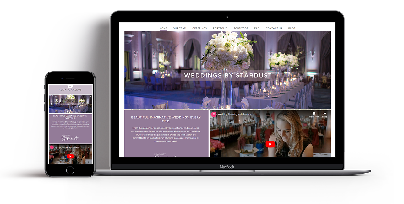
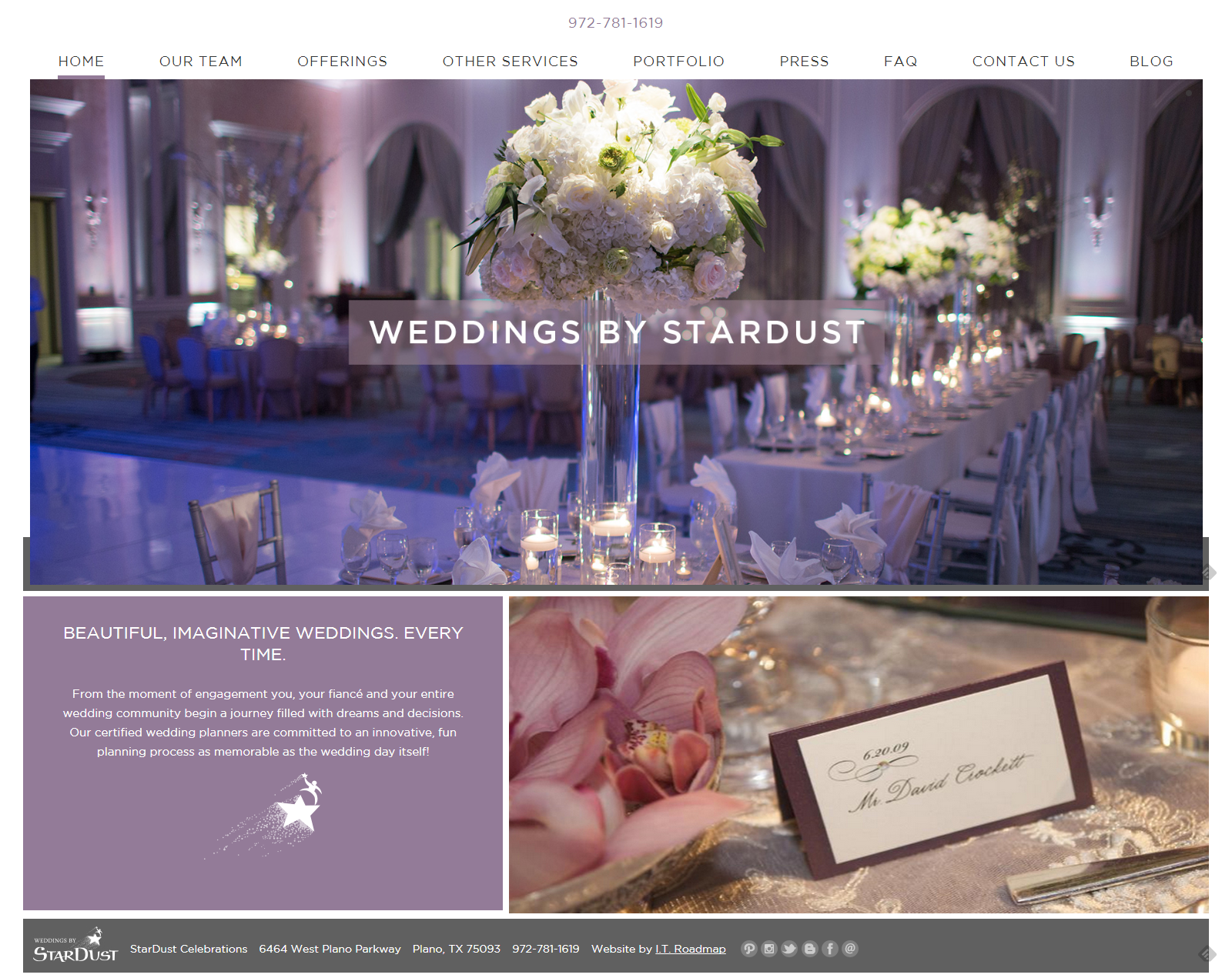
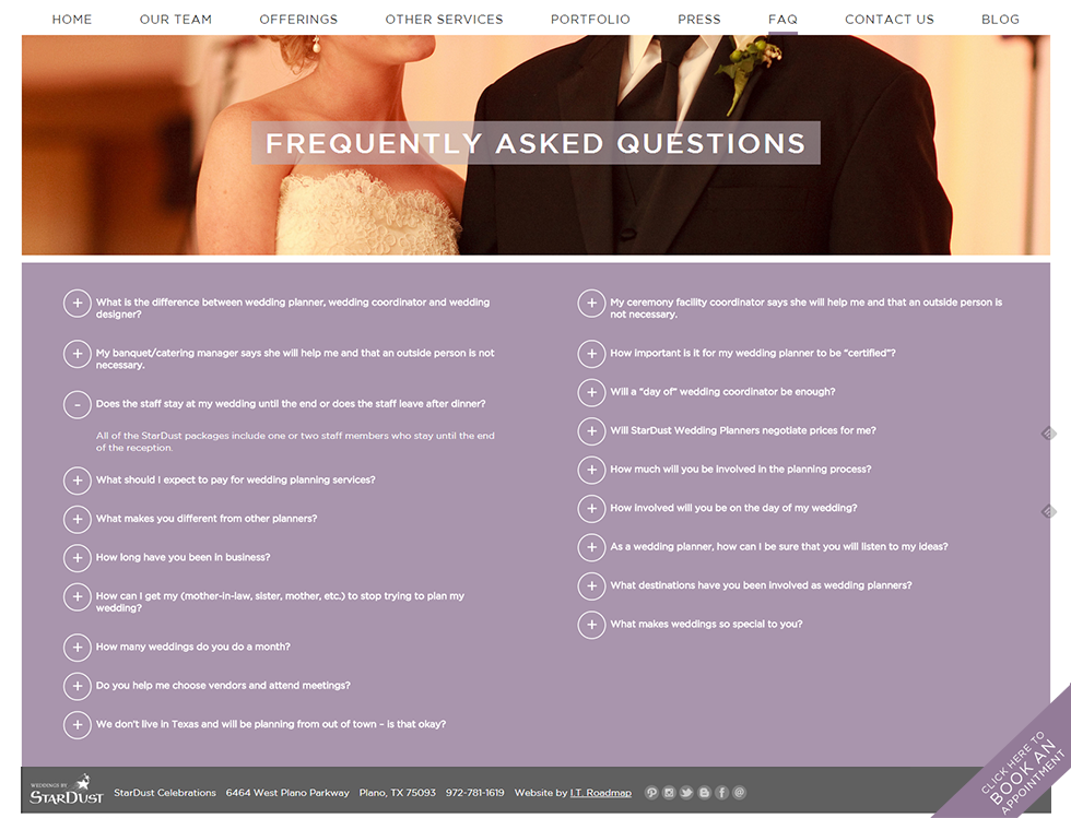
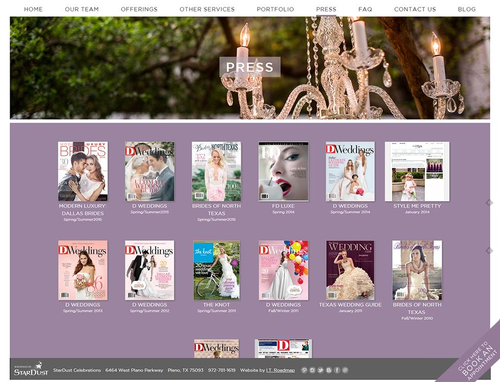
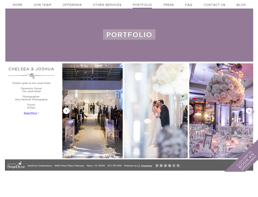
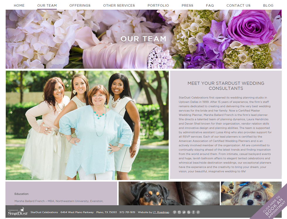
We took inspiration from a violet color used for the umbrella StarDust brand and pushed it to a more muted tone, complementing it with the spare but lovely typeface Gotham. We used WordPress as the framework, allowing us to efficiently manage the massive number of photos for each wedding in their portfolio. We added a featured image in a banner behind the title on each page, giving us another opportunity to show off portfolio photos. Their press and portfolio are managed with custom post types and custom upload modules created specially for this purpose. A sticky footer at the bottom of each page allows for a helpful call to action—to book an appointment.
Additionally, the website is set up to perform flawlessly in mobile responsive mode, perfect for brides using smartphones to plan their weddings on the go.
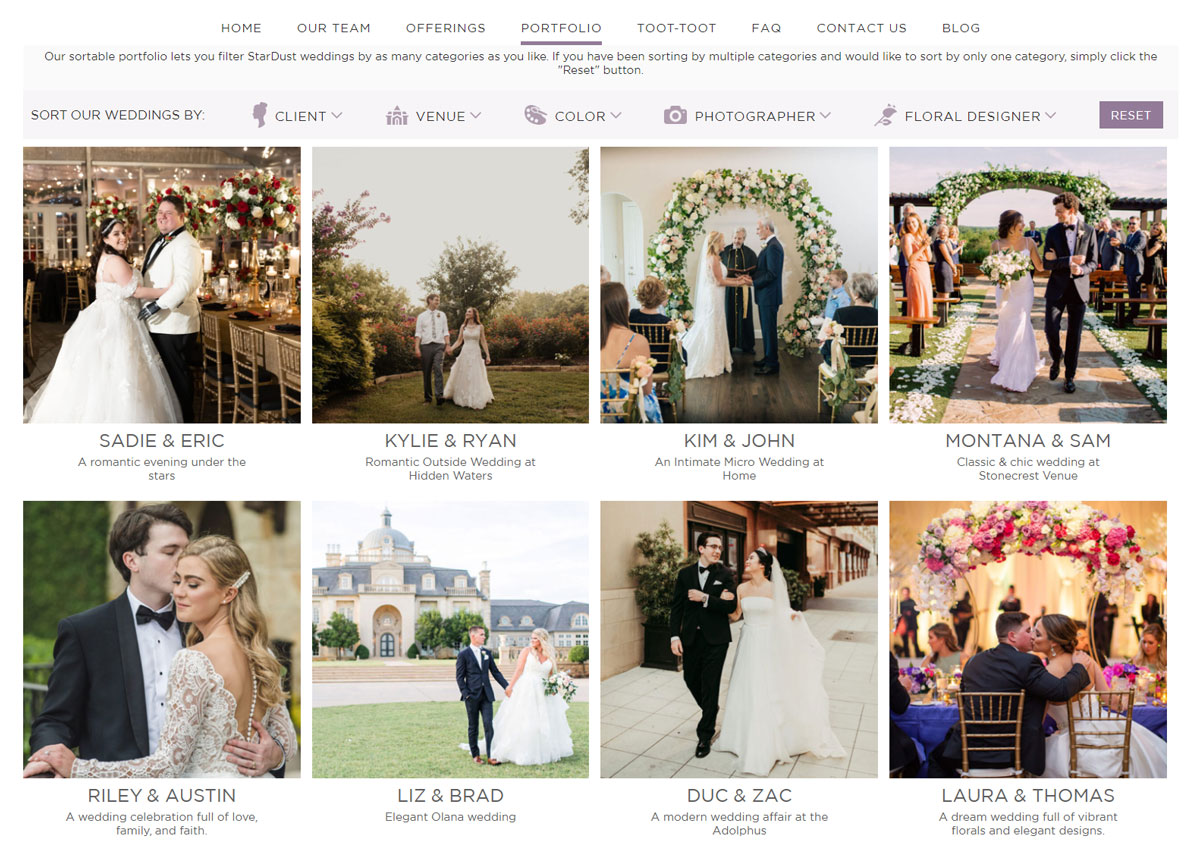
The sortable portfolio is the star of the show on this website. Having created hundreds of gorgeous weddings, it has become an invaluable resource for brides who want to research venues, or compare the work of different wedding photographers all in one spot, or see what their chosen color scheme could look like at a StarDust wedding.
Visit weddingsbystardust.com.
