
Our team of web designers and developers collaborated with the doctor’s office to create a new website that would be easy to navigate and provide patients with the information they needed. Here are some of the key features of the new website:
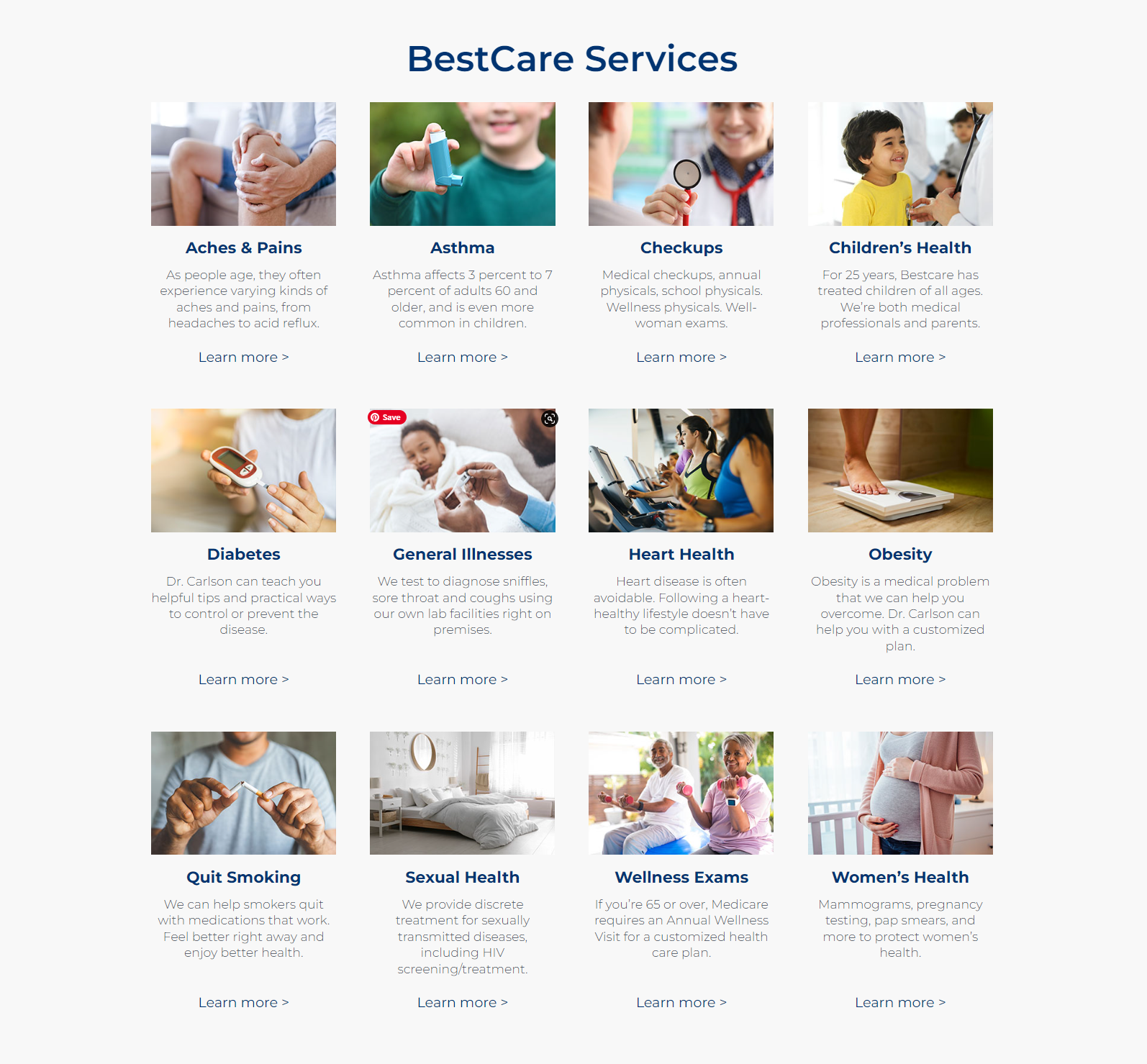
Easy-to-Use Grid for Medical Information
We organized the vast amount of medical information on the website using a grid system. This made it easy for patients to find the information they were looking for without feeling overwhelmed. The grid allowed us to divide the content into smaller, digestible pieces, making it easier to read and understand.
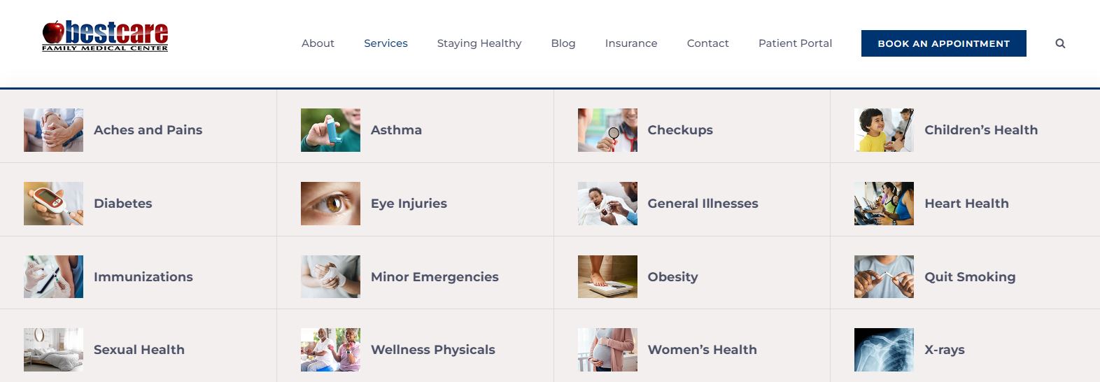
Mega Menu for Quick Exploration
We created a mega menu that allowed patients to navigate to the most common health problems treated at the medical practice. This menu was designed to be both visually appealing and easy to use. Patients could quickly find the information they needed and navigate to other parts of the website.


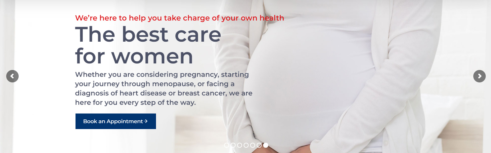

Homepage Slideshow for Easy Navigation
To make it easier for patients to navigate to information about their health concerns, we added a slideshow to the homepage. The slideshow highlighted the most important sections of the website, making it easy for patients to find what they needed.
Emergency Notices Module
We added a module that allowed the office manager to quickly and easily add emergency notices to the homepage without needing any ability to use WordPress. This feature ensured that patients could get the information they needed in case of an emergency.
Reviews Module for Social Proof
To provide social proof and build trust with patients, we embedded a module that showed the practice’s most current reviews. Patients could see the experiences of others and make an informed decision about the medical practice.
Visit bestcaregarland.com.